
Content blocks: text, images, features, steps, and more
Content blocks are the workhorses of your website — the sections that carry your actual message: paragraphs, images, feature lists, comparisons, FAQs, and more. This guide walks through every block in the Content group so you can pick the right one instead of forcing the wrong one to fit. Only community owners and admins can edit the website, inside the orange platform panel.
How to add a content block
- Open the full-screen editor (see Open the website editor) and click the page you want to edit.
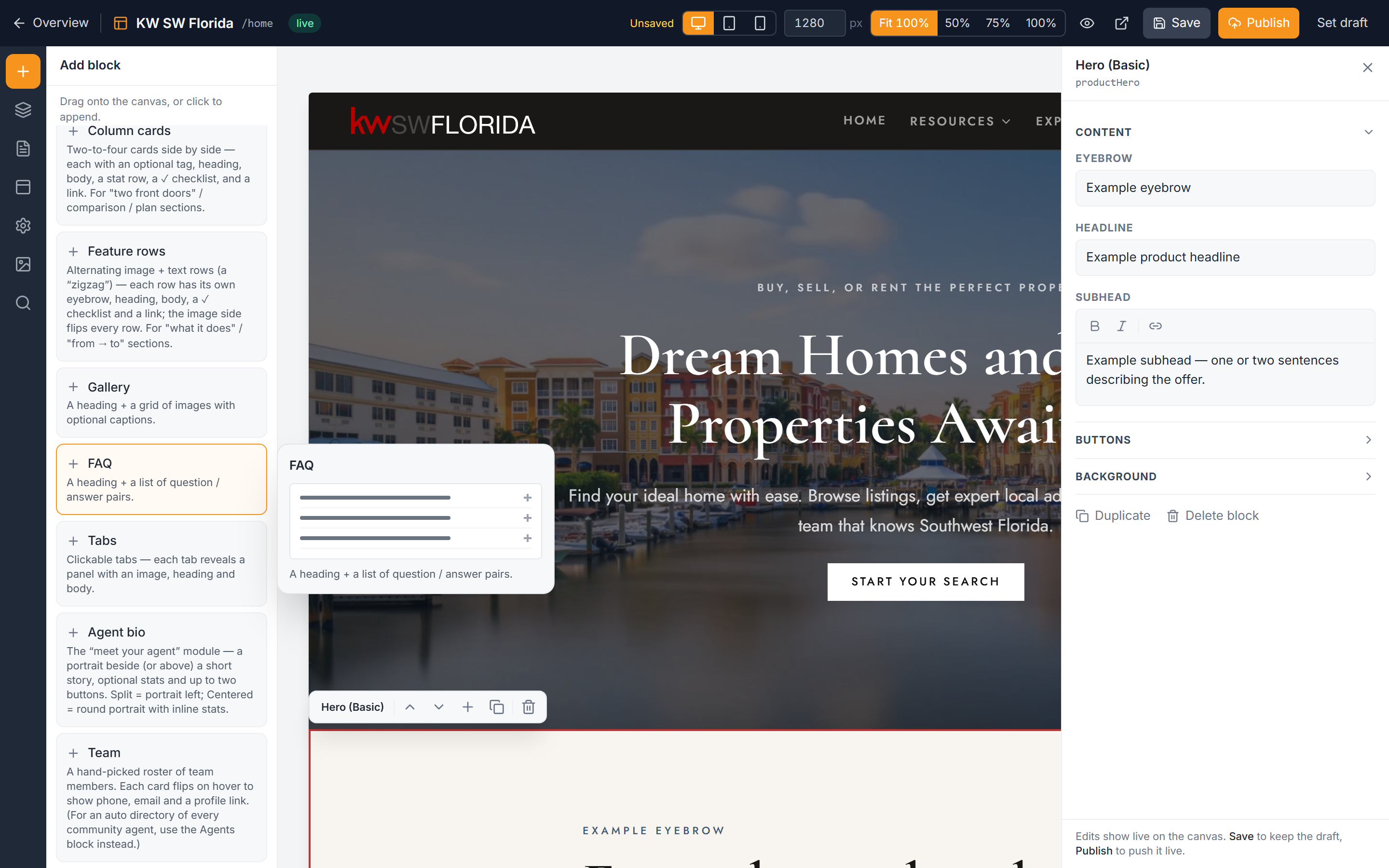
- In the left icon rail, click Add to open the Add panel.
- Choose the Content group.
- Click the block you want. It drops onto the canvas.
- Select the block and fill it in using the right-hand inspector.
For the mechanics of moving, reordering, and duplicating blocks once they're on the page, see Add, move, and remove blocks. For editing text and swapping images, see Edit a block's content.
The everyday text blocks
These are the ones you'll reach for most.
- Section header — an intro cap for a new part of the page: a small eyebrow label, a title, and a subtitle. Use it to announce what comes next.
- Text — a heading plus a rich-text body. The body supports bold, italic, links, bullet lists, and `##` sub-headings, so it's your go-to for longer written passages.
- Image + text — an image beside a heading, body, and optional button. You can place the image on the left or right and choose from several height modes to control how tall it sits.
Blocks for features, steps, and comparisons
When you need structure rather than prose, these give it shape.
- Feature grid — a grid of cards, each with an icon, image, title, body, optional pill chips, and a link. The icon can be a lucide icon name, an emoji, or an uploaded image.
- Steps — a walkthrough shown either as a numbered list or as a vertical flow diagram of boxes joined by arrows, with an optional side panel for extra context.
- Column cards — 2 to 4 cards side by side, each with a tag, body, a stat row (one `value | label` per line), a checklist of ✓ items, and a link. Perfect for comparing plans or options.
- Feature rows — an alternating image-and-text "zigzag" that steps down the page, ideal for walking through several features in sequence.
Blocks for depth and detail
Use these to answer questions and show more.
- Gallery — an image grid with captions, for showing a collection at a glance.
- FAQ — a list of question-and-answer pairs. Great for handling common objections in one place.
- Tabs — clickable tabs where each tab reveals its own image, heading, and body, so you can pack several stories into a compact space.
- Video — an inline mp4 video with a poster image that shows before it plays.
Blocks for emphasis
Small accents that make a point stand out.
- Callout — an accent note with a lead-in line. Turn on Pair above to glue it directly under the previous block so the two read as one unit.
- Pull quote — a large display quote with one phrase highlighted, for a memorable line.
Related block groups
Content blocks aren't the only sections available. For testimonials, logos, and stat bars, see Add social proof. To capture inquiries directly on the page, see Add a contact or lead form.
Troubleshooting
My icon isn't showing in a Feature grid card
The icon field accepts three things: a lucide icon name, an emoji, or an uploaded image. If you typed a lucide name, check the spelling matches an existing icon exactly — a misspelled name shows nothing. When in doubt, paste an emoji or upload an image instead.
My stat row or checklist looks wrong in Column cards
The stat row expects one entry per line in the format `value | label` — the value and label separated by a vertical bar. The checklist expects one ✓ item per line. If everything runs together, put each entry on its own line.
My Callout is floating on its own instead of under the block above it
Turn on Pair above in the Callout's settings. That glues it to the block directly above so the two sit together as a single unit.
The Text block body isn't formatting
The body is rich text: use `**` around words for bold, `*` for italic, `##` at the start of a line for a sub-heading, and `-` at the start of a line for bullet points. Formatting only applies when the marks are placed correctly around the text.