
Change a section's background (light, dark, brand, image, or gradient)
Alternating the background behind each section is the fastest way to make a page feel designed rather than flat. A light band, then a dark band, then a brand-colored call to action gives visitors a natural rhythm as they scroll. Every body block on your community website carries the same background control, and text, borders, and cards recolor themselves for contrast automatically — so you never have to guess a text color.
Set a section's background
Section backgrounds are set one block at a time, inside the full-screen website editor. (New to the editor? Start with Open the website editor.)
- Click the block on the canvas whose background you want to change. Its settings open in the inspector on the right.
- Open the Background accordion.
- Under Section background, pick one of the options:
- Default (page) — uses the theme's smart default for this kind of block.
- Light — a light band.
- Dark — a dark band.
- Brand color — fills the section with your accent color.
- Image — a full-bleed cover photo behind the section.
- Gradient wash — a two-color color blend.
- Your choice previews live on the canvas as you pick it. There's nothing extra to save at the block level — publish the site when you're ready for visitors to see it (see Take your website live).
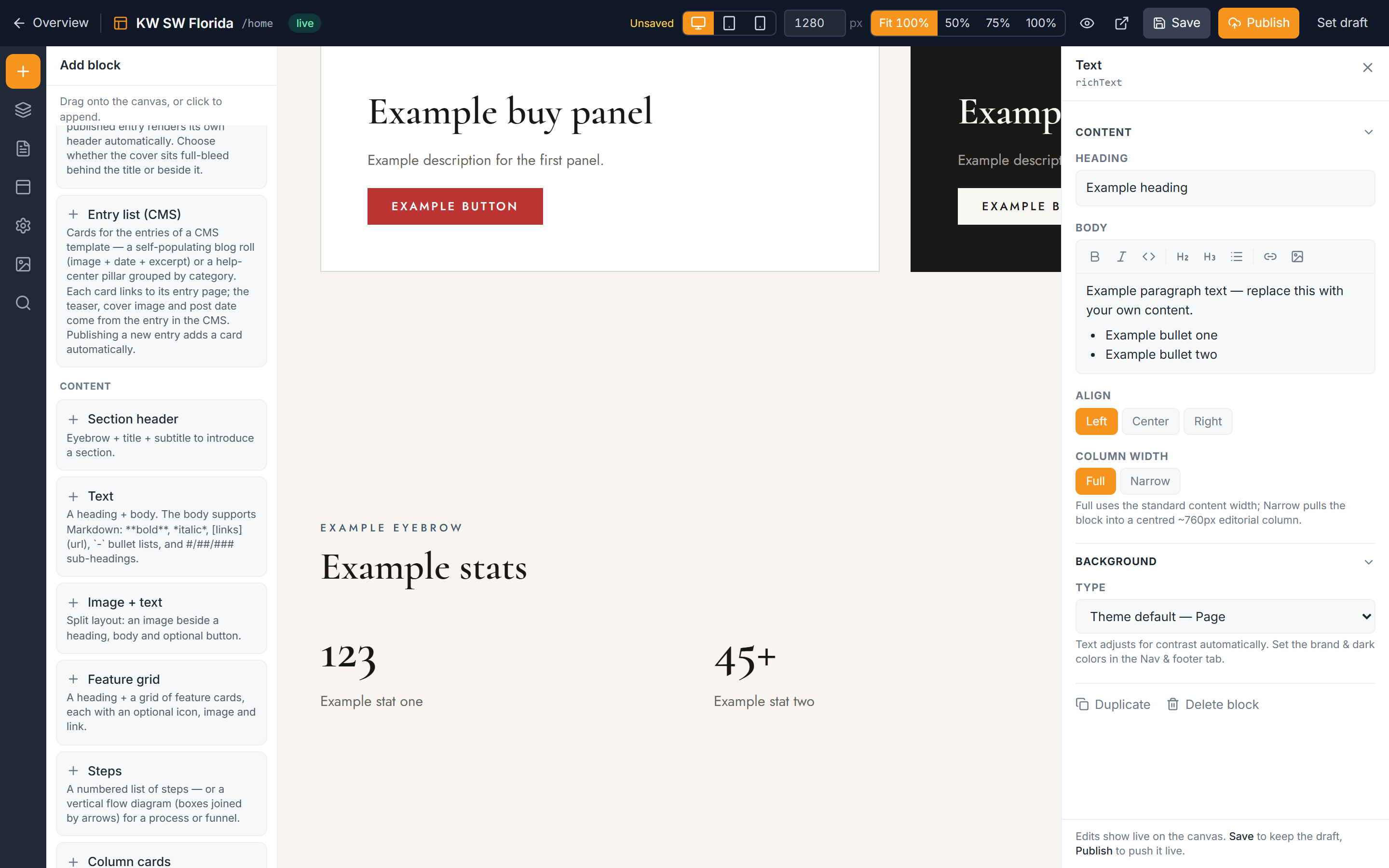
What "Default (page)" does
Default (page) isn't "no background" — it hands the decision to your theme. Most sections come out on the page's base surface, but the theme applies smart defaults where a band usually looks best: hero, call-to-action, and footer sections tend to default to a dark band. Some themes lean darker than others — the Estate theme, for example, darkens more of the page by default. If you never touch this control, your pages already look intentional.
Use an image background
Choosing Image reveals a few extra controls:
- Upload a cover photo. This becomes the full-bleed background for the section.
- Set Crop to control which part of the photo stays visible as the section resizes: Center, Top, or Bottom.
- Drag the Overlay strength slider to darken the photo behind your text. More overlay means more readable text; less overlay lets more of the photo show through.
Image backgrounds also expose the two gradient stops (see below), so you can tint the overlay from one color to another.
Use a gradient wash
Gradient wash (and the tint on an image background) blends between two colors. You control:
- From — the starting color of the blend.
- To — the ending color.
- Angle — the direction the blend travels across the section.
Because there are only ever two site colors to draw from (your accent and your dark tone), gradients stay on-brand no matter how you combine the stops.
Contrast is handled for you
You never hand-pick a text color for a section. When you switch a background from light to dark, or drop in a dark image overlay, the section's text, borders, and card surfaces automatically flip to stay readable. This is why the control offers bands and washes rather than a free color picker — the system needs to know the tone of the background so it can pick the right text color on top.
If you want to change the actual colors those bands and buttons use, that happens elsewhere — see below.
Where the colors come from
Two facts shape everything here:
- There are only ever two site colors — an accent and a dark tone. You set both in Nav & footer, under your brand colors. Every Light, Dark, Brand, and Gradient option is built from those two. To change the palette site-wide, see Set your site brand colors.
- There is no per-element custom color. You can't paint one heading purple or one card a one-off shade. That constraint is deliberate — it keeps every page consistent and on-brand.
Button colors follow the same two-color system and adapt to the band they sit on; tune them in Style your buttons.
Troubleshooting
My nav or footer won't change background
The Section background control doesn't apply to the navigation bar or the footer. Those are a single shared band across every page, styled in Nav & footer, not per-section. Adjust them in Build your footer and your site navigation settings.
A hero or lead form ignores the background I picked
Some blocks bring their own media or styling — heroes with a background image, or lead-form sections with a built-in surface — and those can override the Section background you choose. Set the background from within that block's own image or media controls instead. See Hero blocks and Add a lead form.
My text is hard to read on an image background
Increase the Overlay strength slider on the image background. A stronger overlay darkens the photo behind your text so the auto-contrast text color has enough to sit against.
I can't find a custom color picker
There isn't one — the site uses exactly two colors (accent and dark), set in Nav & footer. Every background option is built from those. To shift the look of the whole site, change the brand colors in Set your site brand colors.